

Reading time
8 mins
44.8% increase in holiday season revenue
14.4% increase in holiday conversion rates
$1.67mm increase in first year revenue
388% increase in advertising revenue first year
When a custom gift company started to see a YoY decline in revenue growth, the founder sought Opascope’s help.
They reached out in October, and the company did over 70% of its annual revenue in mid-November and December. We acted quickly and improved the company’s holiday revenue by 45%. Over the course of a year, we also increased the company’s annual revenue by 61%.
What follows are four strategies we used to ramp up and optimize the company’s holiday performance.
Note: Are you gearing up for the holidays? We’ll run a free audit on your account, check out your past holiday performance, and make suggestions for how to increase revenue this year. Book an intro call here.
01 · We Optimized Their Branded Searches
When we dug into the account, we quickly found that the company had a “quick and dirty” implementation for branded searches. Their exact match, phrase match, and modified broad match searches were all being treated the same. As a result, their branded campaigns had a low impression share because they were spread too thin.
Because they were well known in the space, their competitors were taking advantage of their branded searches and siphoning off sales.
To fix this, we segmented the campaigns to prioritize exact match searches where you want the highest impression share. Since Google rewards relevance, we were able to outbid competitors without increasing overall spend by simply allocating more of the campaign budget to exact match results.
For phrase match and long-tail searches, you still want high impressions, but you have to be more focused on the cost per conversion. Otherwise, you can end up paying for random long-tail variants of a phrase that has nothing to do with your products.


Takeaways
-
Prioritize exact match searches in your branded campaign budget
-
Keep a closer eye on your phrase and broad match results to make sure you’re not spending $$$ on irrelevant searches
02 · The Bigger Opportunity Was On Facebook
Besides optimizing their brand campaigns, we found that the bigger paid opportunity was on Facebook. Here’s why.
When deciding what budget to allocate to Google versus Meta, here’s a quick rule of thumb:
If it’s an existing product that people know they need, Google tends to work best.
Google is really good at capturing pre-existing demand where people are intentionally searching for something that they need. Your ads will be highly relevant to specific searches, which means lower costs-per-click (CPC) and higher conversion rates. A strong SEO presence also works well in this case, especially if your brand is already well known in your market.
If people don’t know that what you’re selling is an option and they’re not searching for it, Google’s not ideal. The only approach is to bid on tangentially relevant things which means your quality score might be lower and you end up with a higher CPC. You’ll also wind up with lower-quality clicks from people that don’t actually want to buy the product.
If your product or market is relatively unknown, Facebook or social advertising is a better approach.
Social advertising can work really well if you have a product that’s unique and will attract people’s attention. Since ads aren’t based on searches, you won’t be penalized for being in a lesser-known market or having a unique product.
The custom gift company was already running non-branded Google search ads that performed pretty well, but there wasn’t a large search volume for anything closely related to their products. So there wasn’t obvious room to grow.
On Meta — specifically Facebook — there was a bigger opportunity to introduce new people to the product. One of the benefits of Facebook’s ad platform is the ability to more effectively explain what your company or product is all about. Where Google search ads only give you a couple of lines of text, when you advertise with Facebook, you can use more text, videos, etc, to differentiate your product or services.
There’s also significantly more brand exposure through Facebook.
Takeaways
-
Don’t try to force Google to work for you. If there are not many highly relevant searches for your products, try something else — like Meta advertising
-
Just remember that performance marketing is unique to each business. Iterate based on your metrics and not a rule of thumb
03 · We Switched From Static to Video Ads


The company was already running ads on Facebook, but we believed performance could be better. We found that click-through rates were low on the ads, but when users did click through, they stayed engaged on the site. Because of this, we knew if we could bring in more traffic from Facebook, we’d see good results.
This called for better ads.
The ads that the company was running were still images of its products with a couple of lines of text about ordering for the holidays. But the images didn’t portray the real value of ordering from the company: that you can customize gifts and send them directly to friends and family.
We created short videos showing the process of customizing the gift and entering people’s addresses. The conversion rates on these explainer videos were huge.
Takeaway
If your product or process is difficult to explain, video ads may perform better than static images.
04 · We Focused On Improving Their Site’s Mobile Experience
Thanks to a great organic presence and word-of-mouth brand exposure, the company’s site traffic had been increasing each year by 40% to 60%. But their revenue growth rate was declining. This meant the site wasn’t converting as well as it used to.
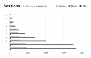
Digging into the metrics, we noticed that 65% of site traffic came from mobile devices. This percentage had been steadily increasing every year. But the company hadn’t focused much on their site’s mobile experience.
Some issues were easier to fix than others: their layout engine didn’t work correctly on mobile, and their default font was hard to read on smaller screens. But the bigger problem is that the entire purchase flow — from customizing a gift, adding addresses, and checking out — wasn’t an optimal experience to do on one’s phone.
Instead of trying to fix the entire checkout process, we worked on optimizing the experience for people to start projects on mobile and then complete them on desktop. We optimized the experience for people to create accounts on mobile or start the process of selecting a product. Then, we’d either directly suggest a user switch to desktop with a button that would email them a link to continue on their computers, or encourage them to save their account and continue elsewhere.
We also ran retargeting ads to remind people to finish the project they started.
These changes led to an increase in conversions. As a bonus, we also saw a 30% increase in the average order volume.
When users were checking out via mobile, they tended to only buy one or two gifts at a time. This is likely because the process requires an address, so they’d either use their own or use addresses they could easily look up on their phone.
We found that once we could get users to move to a desktop machine, it was easier for them to send out a link requesting people’s addresses, or upload a CSV. This address request functionality played a big role in increasing order size and, with it, overall revenue.
Takeaways
-
Has your mobile traffic increased dramatically? If so, make mobile CRO a priority
-
If you have a complex sales funnel that’s not ideal on mobile, prioritize helping users save their process and be able to come back to it on a full-sized machine
The More Complicated the Sales Process, The More CRO Matters
Out of everything we did on this account, from optimizing their branded searches to refreshing their Facebook ads, mobile optimization had the biggest impact. This is because of the company’s complicated sales process.
If we’d just focused on bringing in more traffic to their site without optimizing for conversions, they wouldn’t have seen that 45% increase in revenue.
When many marketing agencies aren’t seeing the results they want, their default response is to refresh ads and increase spend. This is short-sighted and not how we operate. We believe in a holistic approach which includes evaluating the entire customer journey and removing obstacles.
Want to know what growth or savings is possible? Book a free audit with us to find out.